Solfeggio
- Industry
- Luxury Goods
- What I did
- Brand Strategy, Logo Design, Type Design, Competitor Audit
- Client
- Personal Project
- Year
- 2024
The Problem
In today’s hyperconnected world, we’ve forgotten the ritual of slowness. Solfeggio emerged to fill a specific market gap: whilst Italy boasts heritage in luxury goods and fashion brands champion exclusivity, there exists no fountain pen brand that authentically blends Italian craftsmanship with genuine accessibility. The market lacked a voice that whispered rather than shouted, that invited ritual without demanding wealth.
Strategy and Vision
Solfeggio positions itself as an antidote to digital noise. These aren’t just tools, but instruments with soul, analogical in a world obsessed with the digital. The brand transforms handwriting into a daily ritual of clarity and presence, countering the anxiety and urgency of contemporary life by celebrating the tactile pleasure of paper and ink.
The Design Process
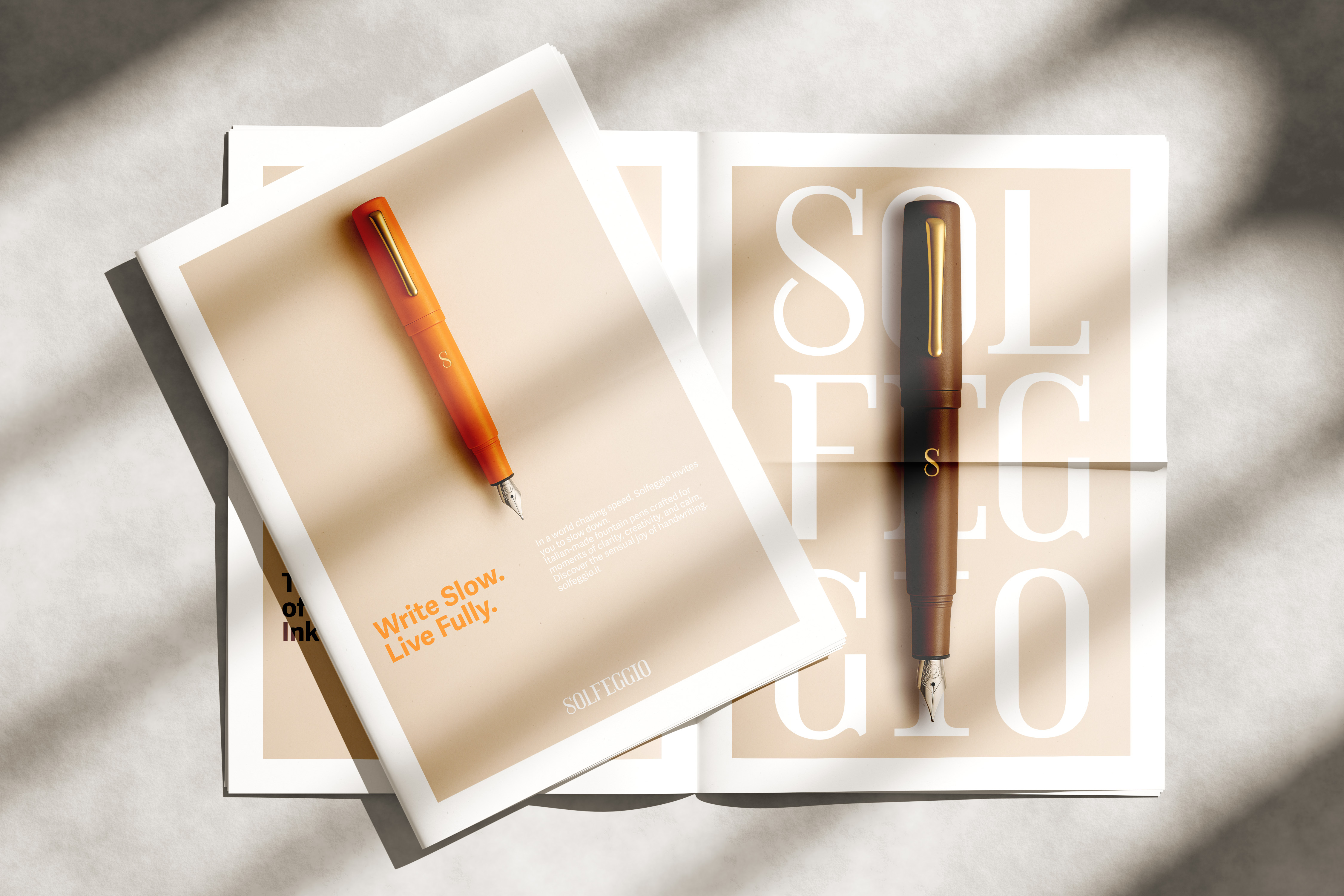
A thorough competitor audit revealed that existing Italian fountain pen brands occupy either the ultra-luxury tier or the mass-market fringe. This gap informed everything. I sketched extensively, exploring how to evoke the fluidity of writing without falling into calligraphic clichés. The breakthrough came through Italian Plate No. 6, a classical serif whose condensed structure and rhythm felt right. I merged its traditional bones with personal sketching, creating a custom serif with a contemporary edge, its curves echoing the cadence of ink on paper.
Logo and Typography
The custom typeface balances classical roots with modern restraint. Where tradition might have leaned decorative, precision takes over. Sharp serifs and measured curves create a mark that feels both authoritative and intimate, reading equally well on a pen barrel or business card.
Colour Palette
Warm, softened tones inspired by sunset hues and the materiality of aged paper. These colours convey quiet energy and emotional resonance, avoiding both the cold minimalism of tech brands and the overwrought nostalgia of heritage labels. The palette sits somewhere between contemplation and warmth.
Outcome
The identity system extends across logo, custom typography, brand strategy documentation, and a comprehensive competitive analysis. Every choice prioritises longevity and consistency, creating a foundation for a brand built to grow intentionally rather than reactively.